04Design studio · 2026
Red Spot
A graphic design studio that opens with a bang.
- Client
- Red Spot, Heidi Reyniers
- Year
- 2026
- Languages
- NL
- Type
- Design studio
The challenge
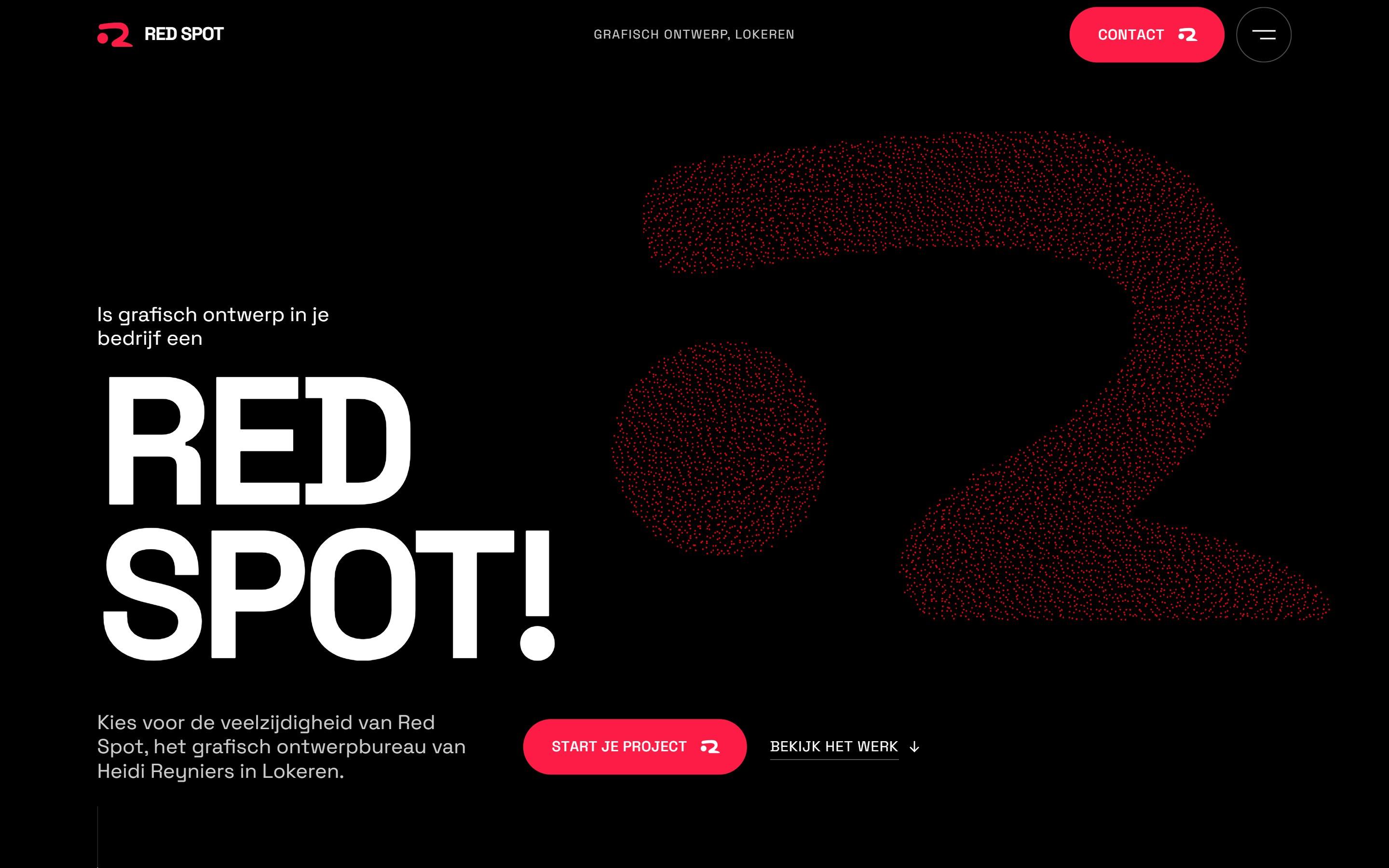
A designer's own site is her portfolio. Red Spot's work is bold, witty and very print driven, so the site had to feel like a poster, show years of projects without turning into a dull grid, and still lead a local business owner straight to a first call.
What I did
- 01
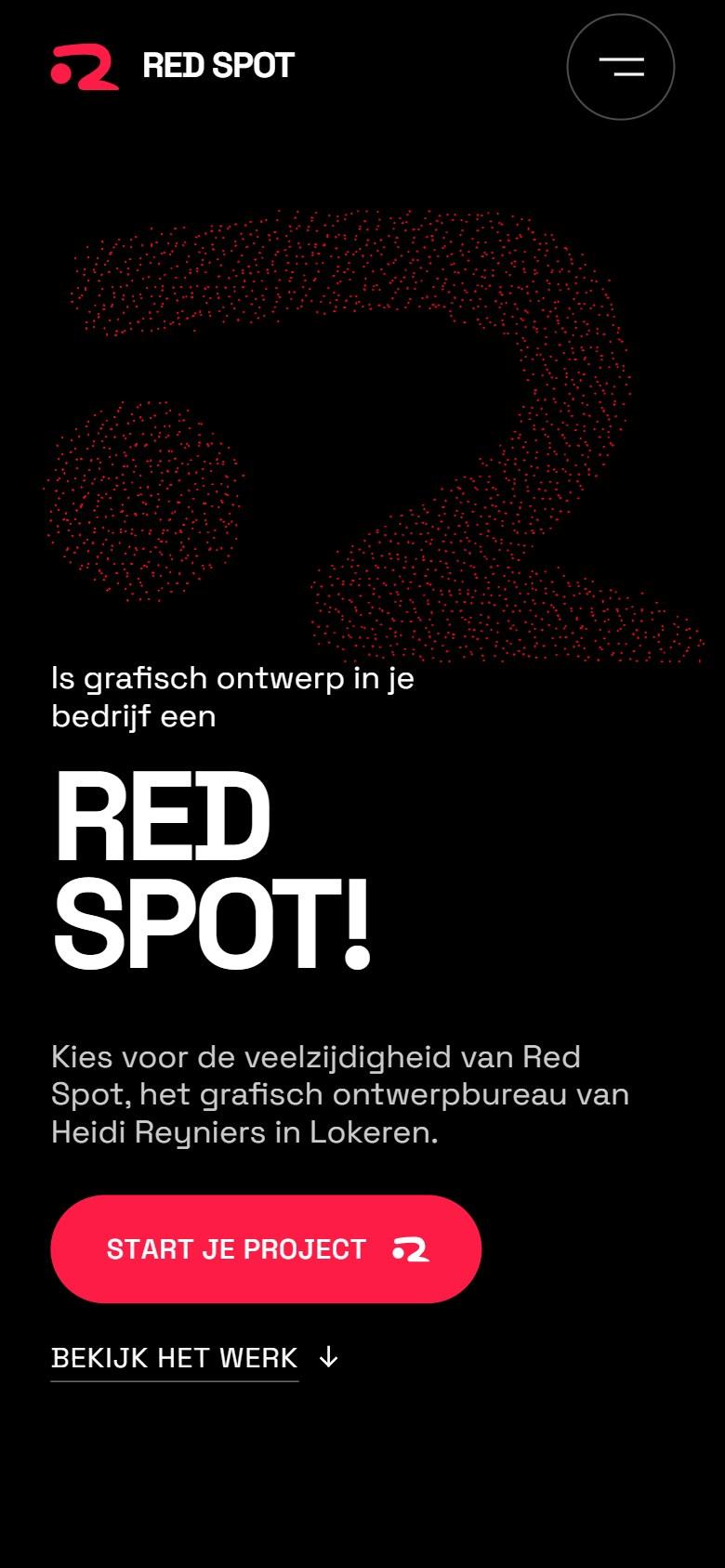
The logo as a cloud of dots
The red R mark is drawn from thousands of tiny particles that settle into shape next to a huge RED SPOT! headline. You know whose site it is before you read a word.
- 02
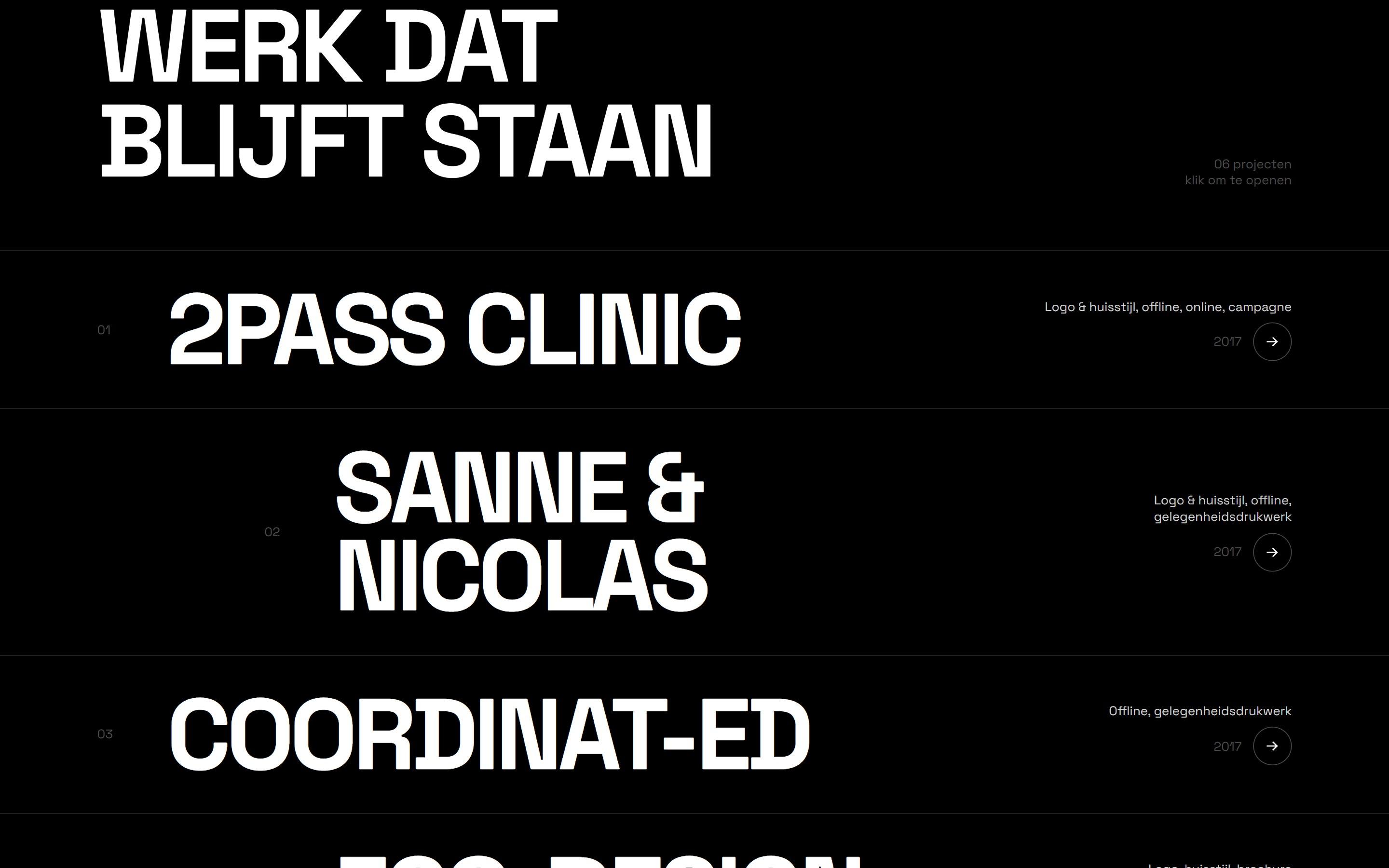
Work set like a poster
Projects are listed in giant type with the client, the disciplines and the year, so the list itself reads like a piece of graphic design. One click opens the full project.
- 03
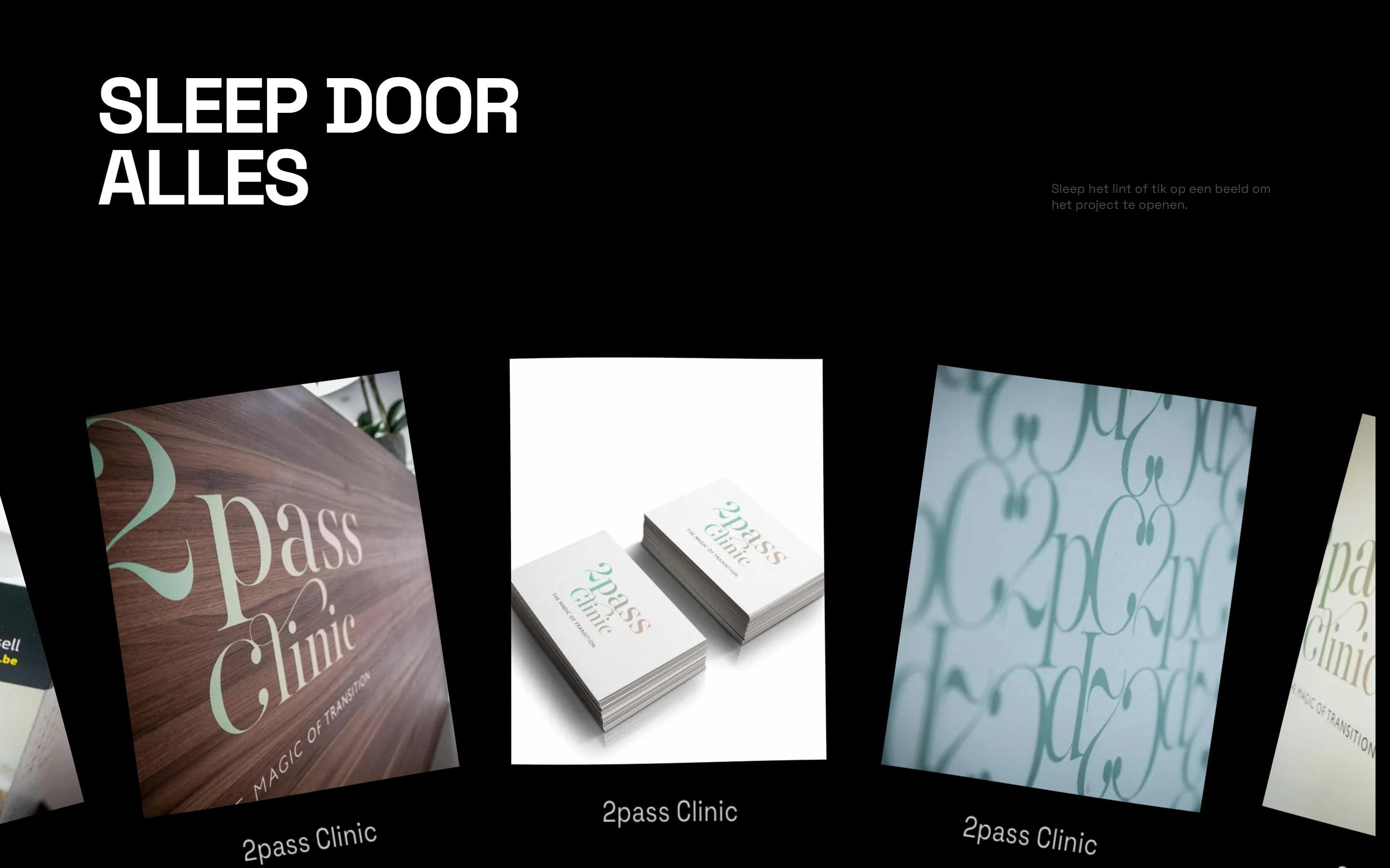
Drag through everything
A curved 3D ribbon holds every image from every project. Visitors grab it and swipe through years of logos, cards and campaigns, then tap any image to open the story behind it.
Lighthouse audit
The receipts.
Google Lighthouse audit of the live site on mobile, September 2026.
92
Accessibility
100
Best practices
100
SEO
The result
A portfolio with as much character as the studio behind it, ending every scroll on one clear invitation: start your project.
Next case · 01
LM Automations